In 2011, Amazon.com debuted a flash sales website called MyHabit. The site specialized in overstock designer merchandise, and garnered over one million customers within the first three months. In 2016, MyHabit merged with Amazon Fashion.
I was a MyHabit launch team member and created the end-to-end experiences for desktop, tablet and mobile. I worked closely with three Amazon VPs during the site's development, and we presented to Jeff Bezos for final approval. During that meeting, Jeff Bezos said, "This site is gorgeous. If it fails, it won't be because of how it looks."
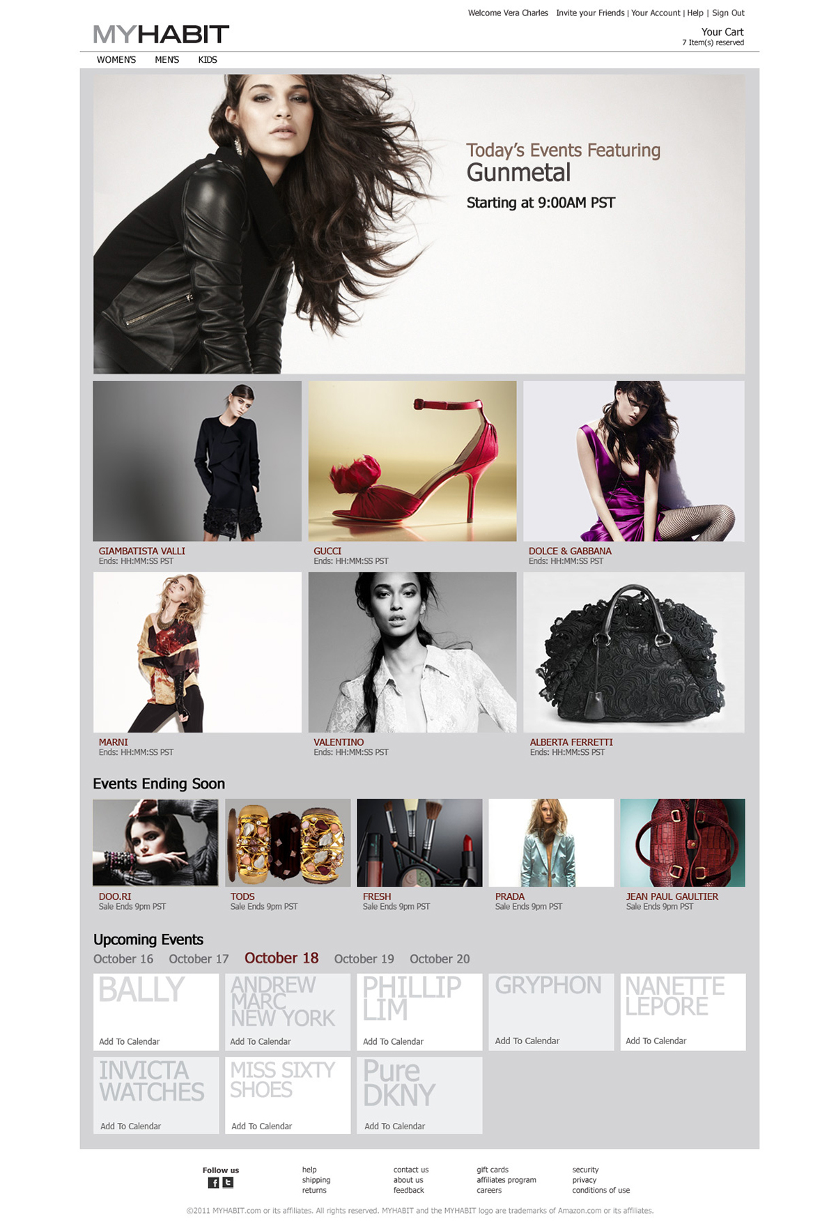
Here you can see the gateway page. This was a collaboration between the creative director and myself. The look was ahead of its time as this was before Apple released its flat aesthetic, which later became the standard for most interactive design. At the time, designers were still heavily focused on the theme of their designs, over-developing chrome that competed with content. The gateway, browse and detail pages of MyHabit focused on product and captured the visceral engagement of high fashion photography.


In later iterations, I experimented with removing even more chrome from the site. Here you can see a browse and detail page. The idea was well received, but the business determined category expansion to be the primary focus. Now six years later, this design approach can be seen in Amazon Fashion and many other retail sites.


A key component to any flash sales website is the mobile app. With limited quantities and a specific start time to events, customers need to have access no matter where they are. During my competitive research on both flash-based websites and online retail, I noticed a trend in design that failed to understand how customers shop, specifically how detailed images of products were the last thing you’d see in the browse flow. Mobile shopping is already challenged with small pictures. The flow that all online retailers used at the time exacerbated that problem.
Here you can see an early iteration of both the browse view and detail page. Product images are barely visible while titles and details seem to be the focus. This is how all online retail was executed then, including Amazon.com.


A key insight from Amazon's research team educated my design: larger images sell more products. It's such a simple idea, but it was lost on mobile. So I challenged myself with rethinking how to cut the space in order to maximize product images while surfacing details. After much exploration, this was my final design.


Hot on the heels of the launch of Amazon's first tablet, I was charged with tailoring the MyHabit experience to fit the new device. This design came together quickly as I had already created the desktop and mobile experiences.


